Bizarre Dimensions
This is an example of an identity I designed for a hair salon called Bizarre Dimensions. Bizarre Dimensions is a cutting edge salon focusing on modern trends. Below you will see the branding book I developed in order to introduce their new identity. To see my design process in developing the visual identity, please scroll to the bottom of this page.
The Process
RESEARCH & IDEATION:
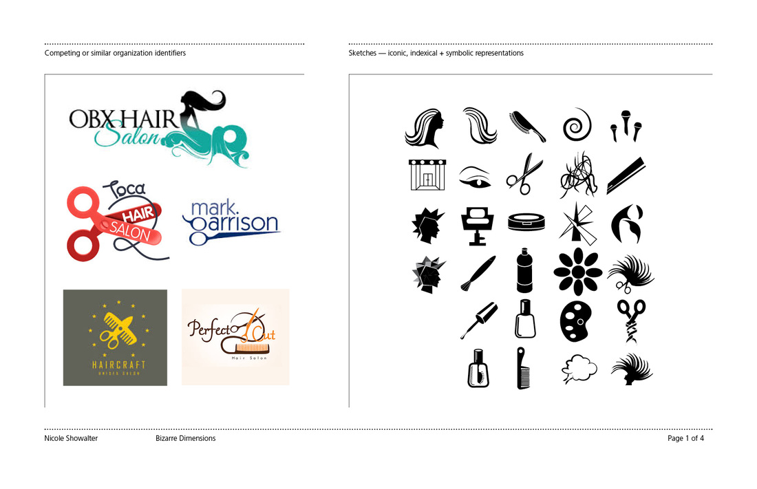
The first step in my design process is usually defining my scope of work as well as learning about my client and stakeholders. After getting a feel for what my client wants to represent, I begin doing research on best practices and to find inspiration. This research phase gives me a better understanding of the realm in which my design will live as well as what other people are already doing to solve similar problems. After gathering inspiration I go into sketching. For this project I thought of ways to represent hair salons in iconic, indexical and symbolic ways in order to go further than the base understanding on what a hair salon does or the typical image hair salons portray.
The first step in my design process is usually defining my scope of work as well as learning about my client and stakeholders. After getting a feel for what my client wants to represent, I begin doing research on best practices and to find inspiration. This research phase gives me a better understanding of the realm in which my design will live as well as what other people are already doing to solve similar problems. After gathering inspiration I go into sketching. For this project I thought of ways to represent hair salons in iconic, indexical and symbolic ways in order to go further than the base understanding on what a hair salon does or the typical image hair salons portray.
DEVELOPMENT & REFINEMENT:
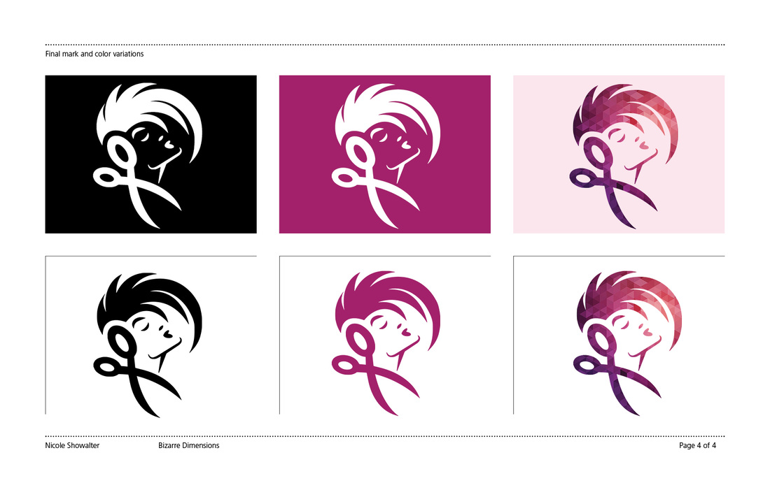
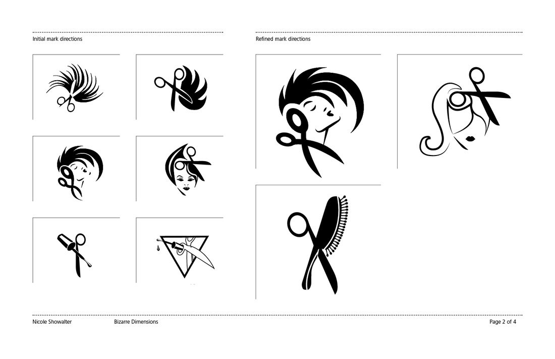
After my initial sketching and ideation phase, I looked at ways to combine some of these symbols that best represented the bold, dynamic and energetic nature that Bizarre Dimensions was trying to portray. After my initial visual mark ideation, I chose six that stood out to me as the best representations of the company. I then took these for feedback to see if they were being perceived in a positive way and were identifiable as a hair salon mark. After getting feedback, I refined and narrowed the concepts down to three options and down to the final mark after deliberation with other designers and stakeholders.
After my initial sketching and ideation phase, I looked at ways to combine some of these symbols that best represented the bold, dynamic and energetic nature that Bizarre Dimensions was trying to portray. After my initial visual mark ideation, I chose six that stood out to me as the best representations of the company. I then took these for feedback to see if they were being perceived in a positive way and were identifiable as a hair salon mark. After getting feedback, I refined and narrowed the concepts down to three options and down to the final mark after deliberation with other designers and stakeholders.
USER TESTING & FINAL REFINEMENT:
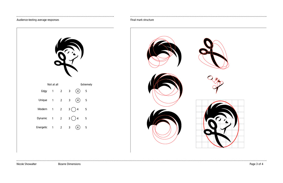
After narrowing down my concepts and choosing a final design, I sent it out to 20 random people in order to get audience feedback on how my mark was representing the 5 key concepts that Bizarre Dimensions was trying to embody. After getting reassuring feedback, I made final cosmetic touches to the design and construction of the mark.
After narrowing down my concepts and choosing a final design, I sent it out to 20 random people in order to get audience feedback on how my mark was representing the 5 key concepts that Bizarre Dimensions was trying to embody. After getting reassuring feedback, I made final cosmetic touches to the design and construction of the mark.
FINALIZATION & COLOR CONCEPTING:
After refining the mark, I began color selection and adding texture to the mark to give it more personality. After this final step, the mark was ready for application and typographic combination.
After refining the mark, I began color selection and adding texture to the mark to give it more personality. After this final step, the mark was ready for application and typographic combination.