Glenn Performance Branding
Glenn Performance is a Personal Training and Fitness Coaching company focusing on helping customers get to the better version of themselves. The client was looking for a professional logo design that would establish them as a trusted source for health information and fitness coaching. The company was also expanding its offerings into sports fitness coaching, so they needed a logo that could be adaptable.
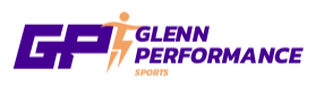
The Final Logo
|
|
|
Based on our discussion, this logo utilizes the G & P from Glenn Performance to create a quick hitting, recognizable mark. A deep purple was used to make it more professional and timeless and is accompanied by a bright orange for high contrast. The slanting of the letters along with the swoosh fades give the mark a sense of motion which speak to fitness, performance and sports training. These are also recognizable design aesthetics from sports team brands, which help customers better understand the purpose of the company. A ball is added to the mark when needed for the sports training/partnerships.
Sports Logo Version
|
|
|
Other Versions That Were Not Selected

|


|
