|
|
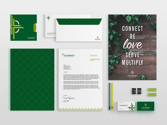
Journey Community ChurchPlain City United Methodist Church came to me in need of a brand redesign as they aimed to rename their church and open at a new location. As a church that has been around for hundreds of years, they were looking to become more modern to appeal to younger generations, while still maintaining the integrity of the church's history.
Not only was the name changing and need an main identity, but the church also asked me to create sub-branding for the student and children's ministry programs that would relate to the brand as a whole but still be unique and differentiate as their own look and feel. |
The Main Logo
|
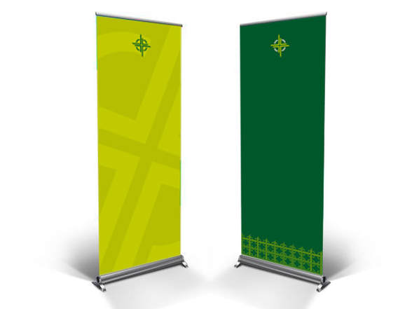
Their new visual identity needed to represent their new pillars of the church mission and symbolize the coming together of people in all walks of life, on separate but joined journeys. The overall aesthetic needed to be calm, inviting, and earthy.
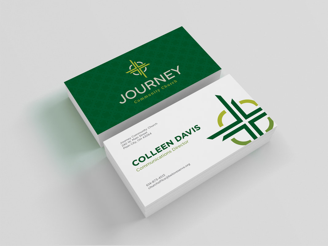
The final mark was created using inspiration drawn from the form of a cross, which ties back to the classic Methodist Church logo, an arrow that symboilzes pointing you to Christ throughout your journey, and a compass to direct you along the way. |
|
|
|
Next Gen LogosAlong with the main visual identity, the church needed complimentary identities for both it’s student and children’s ministry programs. The marks needed to tie back to the original deign but each have their own unique look and feel.
Next Gen was decided upon as the name for these departments. The mark from the main branding was adapted to emphasize the arrows in these designs, alluding to the idea of moving forward with the next generation and looking towards the future. |